Note
Go to the end to download the full example code.
Visualizing AFQ derivatives#
Visualizing the results of a pyAFQ analysis is useful because it allows us to inspect the results of the analysis and to communicate the results to others. The pyAFQ pipeline produces a number of different kinds of outputs, including visualizations that can be used for quality control and for quick examination of the results of the analysis.
However, when communicating the results of pyAFQ analysis, it is often useful to have more specific control over the visualization that is produced. In addition, it is often useful to have visualizations that are visually appealing and striking. In this tutorial, we will use the fury library 1 to visualize outputs of pyAFQ as publication-ready figures.
import os
import os.path as op
import nibabel as nib
import numpy as np

from dipy.io.streamline import load_trk
from dipy.tracking.streamline import transform_streamlines

from fury import actor, window
from fury.colormap import create_colormap

import AFQ.data.fetch as afd
from AFQ.viz.utils import PanelFigure
Get some data from HBN POD2#
The Healthy Brain Network Preprocessed Open Diffusion Derivatives (HBN POD2) is a collection of resources based on the Healthy Brain Network dataset [2, 3]_. HBN POD2 includes data derivatives - including pyAFQ derivatives - from more than 2,000 subjects. The data and the derivatives can be browsed at https://fcp-indi.s3.amazonaws.com/index.html#data/Projects/HBN/BIDS_curated/
Here, we will visualize the results from one subject, together with their anatomy and using several variations. We start by downloading their pyAFQ-processed data using fetcher functions that download both the preprocessed data, as well as the pyAFQ-processed data (Note that this will take up about 1.75 GB of disk space):
afd.fetch_hbn_preproc(["NDARAA948VFH"])
study_path = afd.fetch_hbn_afq(["NDARAA948VFH"])[1]

deriv_path = op.join(
    study_path, "derivatives")

afq_path = op.join(
    deriv_path,
    'afq',
    'sub-NDARAA948VFH',
    'ses-HBNsiteRU')

bundle_path = op.join(afq_path,
                      'bundles')
Read data into memory#
The bundle coordinates from pyAFQ are always saved in the reference frame of the diffusion data from which they are generated, so we need an image file with the dMRI coordinates as a reference for loading the data (we could also use “same” here).
fa_img = nib.load(op.join(afq_path,
                          'sub-NDARAA948VFH_ses-HBNsiteRU_acq-64dir_space-T1w_desc-preproc_dwi_model-DKI_FA.nii.gz'))
fa = fa_img.get_fdata()
sft_arc = load_trk(op.join(bundle_path,
                           'sub-NDARAA948VFH_ses-HBNsiteRU_acq-64dir_space-T1w_desc-preproc_dwi_space-RASMM_model-CSD_desc-prob-afq-ARC_L_tractography.trk'), fa_img)
sft_cst = load_trk(op.join(bundle_path,
                           'sub-NDARAA948VFH_ses-HBNsiteRU_acq-64dir_space-T1w_desc-preproc_dwi_space-RASMM_model-CSD_desc-prob-afq-CST_L_tractography.trk'), fa_img)
Transform into the T1w reference frame#
Our first goal is to visualize the bundles with a background of the T1-weighted image, which provides anatomical context. We read in this data and transform the bundle coordinates, first into the RASMM common coordinate frame and then subsequently into the coordinate frame of the T1-weighted data (if you find this confusing, you can brush up on this topic in the nibabel documentation).
t1w_img = nib.load(op.join(deriv_path,
                           'qsiprep/sub-NDARAA948VFH/anat/sub-NDARAA948VFH_desc-preproc_T1w.nii.gz'))
t1w = t1w_img.get_fdata()
sft_arc.to_rasmm()
sft_cst.to_rasmm()
arc_t1w = transform_streamlines(sft_arc.streamlines,
                                np.linalg.inv(t1w_img.affine))
cst_t1w = transform_streamlines(sft_cst.streamlines,
                                np.linalg.inv(t1w_img.affine))
Note
A virtual frame buffer is needed if you are running this example on a machine that is not connected to a display (“headless”). If this is the case, you can either set an environment variable called XVFB to 1 or you can deindent the following code (and comment out the if statement) to initialize the virtual frame buffer.
if os.environ.get("XVFB", False):
    print("Initializing XVFB")
    import xvfbwrapper
    from xvfbwrapper import Xvfb

    vdisplay = Xvfb()
    vdisplay.start()
Initializing XVFB
Visualizing bundles with principal direction coloring#
The first visualization we will create will have the streamlines colored according to their direction. The color of each streamline will be RGB encoded according to the RAS of the average orientation of its segments. This is the default behavior in fury.
Fury uses “actors” to render different kind of graphics. For the bundles, we will use the line actor. These objects are wrappers around the vtkActor class, so methods of that class (like GetProperty()) are available to use. We like to set the aesthetics of the streamlines, so that they are rendered as tubes and with slightly thicker line-width than the default. We create a function that sets these properties of the line actor via the GetProperty method. We will reuse this function later on, also setting the key-word arguments to the call to actor.line, but for now we use the default setting, which colors each streamline based on the RAS orientation, and we set the line width to 8.
def lines_as_tubes(sl, line_width, **kwargs):
    line_actor = actor.line(sl, **kwargs)
    line_actor.GetProperty().SetRenderLinesAsTubes(1)
    line_actor.GetProperty().SetLineWidth(line_width)
    return line_actor


arc_actor = lines_as_tubes(arc_t1w, 8)
cst_actor = lines_as_tubes(cst_t1w, 8)
Slicer actors#
The anatomical image is rendered using slicer actors. These are actors that visualize one slice of a three dimensional volume. Again, we create a helper function that will slice a volume along the x, y, and z dimensions. This function returns a list of the slicers we want to include in our visualization. This can be one, two, or three slicers, depending on how many of {x,y,z} are set. If you are curious to understand what is going on in this function, take a look at the documentation for the :met:`actor.slicer.display_extent` method (hint: for every dimension you select on, you want the full extent of the image on the two other two dimensions). We call the function on the T1-weighted data, selecting the # x slice that is half-way through the x dimension of the image (shape[0]) and the z slice that is a third of a way through that x dimension of the image (shape[-1]).
def slice_volume(data, x=None, y=None, z=None):
    slicer_actors = []
    slicer_actor_z = actor.slicer(data)
    if z is not None:
        slicer_actor_z.display_extent(
            0, data.shape[0] - 1,
            0, data.shape[1] - 1,
            z, z)
        slicer_actors.append(slicer_actor_z)
    if y is not None:
        slicer_actor_y = slicer_actor_z.copy()
        slicer_actor_y.display_extent(
            0, data.shape[0] - 1,
            y, y,
            0, data.shape[2] - 1)
        slicer_actors.append(slicer_actor_y)
    if x is not None:
        slicer_actor_x = slicer_actor_z.copy()
        slicer_actor_x.display_extent(
            x, x,
            0, data.shape[1] - 1,
            0, data.shape[2] - 1)
        slicer_actors.append(slicer_actor_x)

    return slicer_actors


slicers = slice_volume(t1w, x=t1w.shape[0] // 2, z=t1w.shape[-1] // 3)
Making a scene#
The next kind of fury object we will be working with is a window.Scene object. This is the (3D!) canvas on which we are drawing the actors. We initialize this object and call the scene.add method to add the actors.
scene = window.Scene()

scene.add(arc_actor)
scene.add(cst_actor)
for slicer in slicers:
    scene.add(slicer)
Showing the visualization#
If you are working in an interactive session, you can call:
window.show(scene, size=(1200, 1200), reset_camera=False)
to see what the visualization looks like. This would pop up a window that will show you the visualization as it is now. You can interact with this visualization using your mouse to rotate the image in 3D, and mouse+ctrl or mouse+shift to pan and rotate it in plane, respectively. Use the scroll up and scroll down in your mouse to zoom in and out. Once you have found a view of the data that you like, you can close the window (as long as its open, it is blocking execution of any further commands in the Python interpreter!) and then you can query your scene for the “camera settings” by calling:
scene.camera_info()
This will print out to the screen something like this:
# Active Camera
   Position (238.04, 174.48, 143.04)
   Focal Point (96.32, 110.34, 84.48)
   View Up (-0.33, -0.12, 0.94)
We can use the information we have gleaned to set the camera on subsequent visualization that use this scene object.
scene.set_camera(position=(238.04, 174.48, 143.04),
                 focal_point=(96.32, 110.34, 84.48),
                 view_up=(-0.33, -0.12, 0.94))
Record the visualization#
If you are not working in an interactive session, or you have already figured out the camera settings that work for you, you can go ahead and record the image into a png file. We use a pretty high resolution here (2400 by 2400) so that we get a nice crisp image. That also means the file is pretty large.
out_folder = op.join(afd.afq_home, "VizExample")
os.makedirs(out_folder, exist_ok=True)
window.record(
    scene,
    out_path=op.join(out_folder, 'arc_cst1.png'),
    size=(2400, 2400))
Setting bundle colors#
The default behavior produces a nice image! But we often want to be able to differentiate streamlines based on the bundle to which they belong. For this, we will set the color of each streamline, based on the bundle. We often use the Tableau20 color palette to set the colors for the different bundles. The actor.line initializer takes colors as a keyword argument and one of the options to pass here is an RGB triplet, which will determine the color of all of the streamlines in that actor. We can get the Tableau20 RGB triplets from Matplotlib’s colormap module. We initialize our bundle actors again and clear the scene before adding these new actors and adding back the slice actors. We then call record to create this new figure.
from matplotlib.cm import tab20
color_arc = tab20.colors[18]
color_cst = tab20.colors[2]

arc_actor = lines_as_tubes(arc_t1w, 8, colors=color_arc)
cst_actor = lines_as_tubes(cst_t1w, 8, colors=color_cst)

scene.clear()

scene.add(arc_actor)
scene.add(cst_actor)
for slicer in slicers:
    scene.add(slicer)

window.record(
    scene,
    out_path=op.join(out_folder, 'arc_cst2.png'),
    size=(2400, 2400))
Adding core bundles with tract profiles#
Next, we’d like to add a representation of the core of each bundle and plot the profile of some property along the length of the bundle. Another option for setting streamline colors is for each point along a streamline to have a a different color. Here, we will do this with only one streamline, which represents the core of the fiber – it’s median trajectory, and with a profile of the FA. This requires a few distinct steps. The first is adding another actor for each of the core fibers. We determine the core bundle as the median of the coordinates of the streamlines after each streamline is resampled to 100 equi-distant points. In the next step, we extract the FA profiles for each of the bundles, using the afq_profile function. Before we do this, we make sure that the streamlines are back in the voxel coordinate frame of the FA volume. The core bundle and FA profile are put together into a new line actor, which we initialize as a thick tube (line width of 40) and with a call to create a colormap from the FA profiles (we can choose which color-map to use here. In this case, we chose ‘viridis’). Note that because we are passing only one streamline into the line actor, we have to pass it inside of square brackets ([]). This is because the actor.line initializer expects a sequence of streamlines as input. Before plotting things again, we initialize our bundle line actors again. This time, we set the opacity of the lines to 0.1, so that they do not occlude the view of the core bundle visualizations.
Note
In this case, the profile is FA, but you can use any sequence of 100 numbers in place of the FA profiles: group differences, p-values, etc.
from dipy.tracking.streamline import set_number_of_points
core_arc = np.median(np.asarray(set_number_of_points(arc_t1w, 100)), axis=0)
core_cst = np.median(np.asarray(set_number_of_points(cst_t1w, 100)), axis=0)


from dipy.stats.analysis import afq_profile
sft_arc.to_vox()
sft_cst.to_vox()
arc_profile = afq_profile(fa, sft_arc.streamlines, affine=np.eye(4))
cst_profile = afq_profile(fa, sft_cst.streamlines, affine=np.eye(4))

core_arc_actor = lines_as_tubes(
    [core_arc],
    40,
    colors=create_colormap(arc_profile, 'viridis')
)

core_cst_actor = lines_as_tubes(
    [core_cst],
    40,
    colors=create_colormap(cst_profile, 'viridis')
)

scene.clear()

arc_actor = lines_as_tubes(arc_t1w, 8, colors=color_arc, opacity=0.1)
cst_actor = lines_as_tubes(cst_t1w, 8, colors=color_cst, opacity=0.1)

scene.add(arc_actor)
scene.add(cst_actor)
for slicer in slicers:
    scene.add(slicer)
scene.add(core_arc_actor)
scene.add(core_cst_actor)

window.record(
    scene,
    out_path=op.join(out_folder, 'arc_cst3.png'),
    size=(2400, 2400))
Adding ROIs#
Another element that we can add into the visualization are volume renderings of regions of interest. For example, the waypoint ROIs that were used to define the bundles. Here, we will add the waypoints that were used to define the arcuate fasciculus in this subject. We start by reading this data in. Because it is represented in the space of the diffusion data, it too needs to be resampled into the T1-weighted space, before being visualized. After resampling, we might have some values between 0 and 1 because of the interpolation from the low resolution of the diffusion into the high resolution of the T1-weighted. We will include in the volume rendering any values larger than 0. The main change from the previous visualizations is the adition of a contour_from_roi actor for each of the ROIs. We select another color from the Tableau 20 palette to represent this, and use an opacity of 0.5.
Note
In this case, the surface rendered is of the waypoint ROIs, but very similar code can be used to render other surfaces, provided a volume that contains that surface. For example, the gray-white matter boundary could be visualized provided an array with a binary representation of the volume # enclosed in this boundary
from dipy.align import resample

waypoint1 = nib.load(
    op.join(
        afq_path,
        "ROIs", "sub-NDARAA948VFH_ses-HBNsiteRU_acq-64dir_space-T1w_desc-preproc_dwi_desc-ROI-ARC_L-1-include.nii.gz"))

waypoint2 = nib.load(
    op.join(
        afq_path,
        "ROIs", "sub-NDARAA948VFH_ses-HBNsiteRU_acq-64dir_space-T1w_desc-preproc_dwi_desc-ROI-ARC_L-2-include.nii.gz"))

waypoint1_xform = resample(waypoint1, t1w_img)
waypoint2_xform = resample(waypoint2, t1w_img)
waypoint1_data = waypoint1_xform.get_fdata() > 0
waypoint2_data = waypoint2_xform.get_fdata() > 0

scene.clear()

arc_actor = lines_as_tubes(arc_t1w, 8, colors=color_arc)
cst_actor = lines_as_tubes(cst_t1w, 8, colors=color_cst)

scene.add(arc_actor)
scene.add(cst_actor)
for slicer in slicers:
    scene.add(slicer)

surface_color = tab20.colors[0]

waypoint1_actor = actor.contour_from_roi(waypoint1_data,
                                         color=surface_color,
                                         opacity=0.5)

waypoint2_actor = actor.contour_from_roi(waypoint2_data,
                                         color=surface_color,
                                         opacity=0.5)


scene.add(waypoint1_actor)
scene.add(waypoint2_actor)


window.record(
    scene,
    out_path=op.join(out_folder, 'arc_cst4.png'),
    size=(2400, 2400))
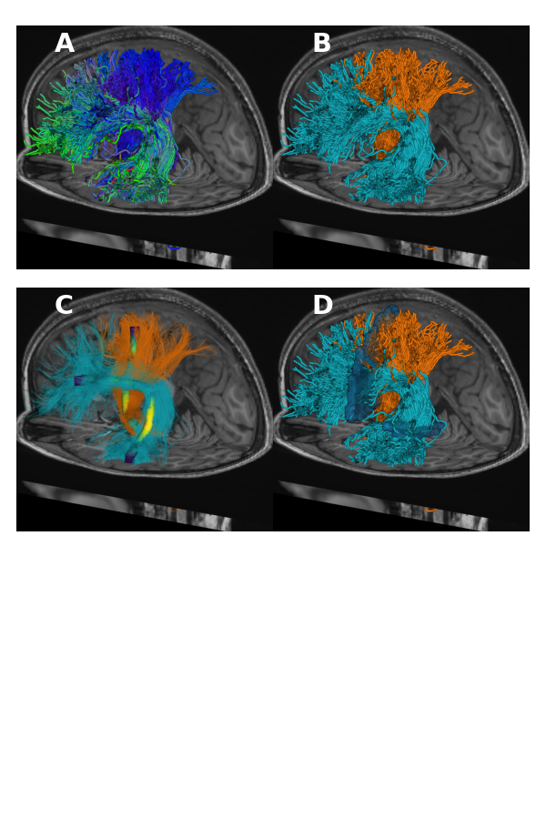
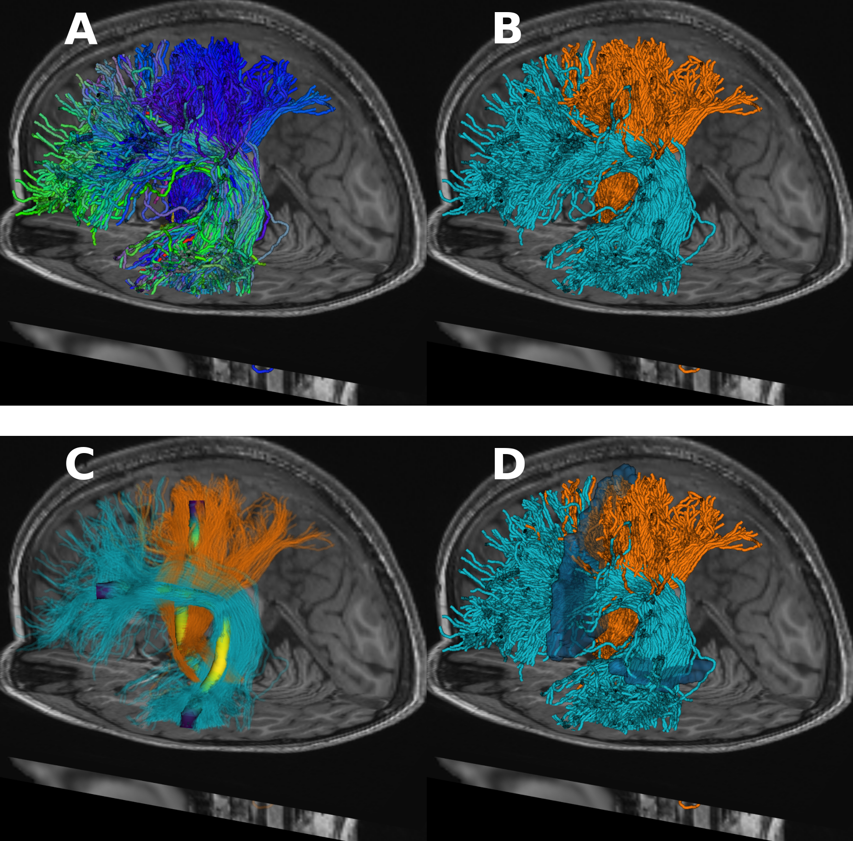
Making a Figure out of many fury panels#
We can also make a figure that contains multiple panels, each of which contains a different visualization. This is useful for communicating the results of an analysis. Here, we will make a figure with four panels, using some of the visualizations we have already created. We will use some convenient methods from pyAFQ.
pf = PanelFigure(3, 2, 6, 9)
pf.add_img(op.join(out_folder, 'arc_cst1.png'), 0, 0)
pf.add_img(op.join(out_folder, 'arc_cst2.png'), 1, 0)
pf.add_img(op.join(out_folder, 'arc_cst3.png'), 0, 1)
pf.add_img(op.join(out_folder, 'arc_cst4.png'), 1, 1)
pf.format_and_save_figure(f"arc_cst_fig.png")
Note
If a virtual buffer was started before, it’s a good idea to stop it.
if os.environ.get("XVFB", False):
    print("Stopping XVFB")
    vdisplay.stop()
Stopping XVFB
References#
- 1
Garyfallidis et al., (2021). FURY: advanced scientific visualization. Journal of Open Source Software, 6(64), 3384, https://doi.org/10.21105/joss.03384
- 2
Alexander LM, Escalera J, Ai L, et al. An open resource for transdiagnostic research in pediatric mental health and learning disorders. Sci Data. 2017;4:170181.
- 3
Richie-Halford A, Cieslak M, Ai L, et al. An analysis-ready and quality controlled resource for pediatric brain white-matter research. Scientific Data. 2022;9(1):1-27.
Total running time of the script: (0 minutes 22.166 seconds)
Estimated memory usage: 22 MB